Business Intelligence Solution to Validate User Adoption of New Features
“Should we create push notifications?
How many notifications should we send in a week?
What about leaderboards? It worked for our competitors”
If you’re managing a digital product, such as a mobile app or a web platform, you might have many questions like these. Whether you draw inspiration from your competitors, or have your own ideas about which features to develop, you may struggle with prioritisation:
What features to build? Which ones should you keep? Which ones resonate with your users, making them love the product and keep coming back?
Digital product analytics provide invaluable support in such situations, offering actionable strategies based on data-driven analysis.
However, many struggle with deriving insights from data:
“We’re having all this data, but how can we get insights out of it?”
If you’re also interested in becoming data-driven, here’s an example of a business intelligence solution. This solution helps product leaders validate which features are more engaging for users, by comparing the retention rates of different features and indicate which ones are more likely to drive user growth.
Report for improving retention rate
Retained users are those who frequently use your app, for example, logging in 3 weeks in a row.
For instance, if 20 out of 100 total users log in three weeks in a row, the retention rate is:
Retention Rate = 20 / 100 = 20%.
The following report created in Power BI helps you measure the retention rate of new features you just released, helping you decide if they will drive user’s growth and justify further investment.
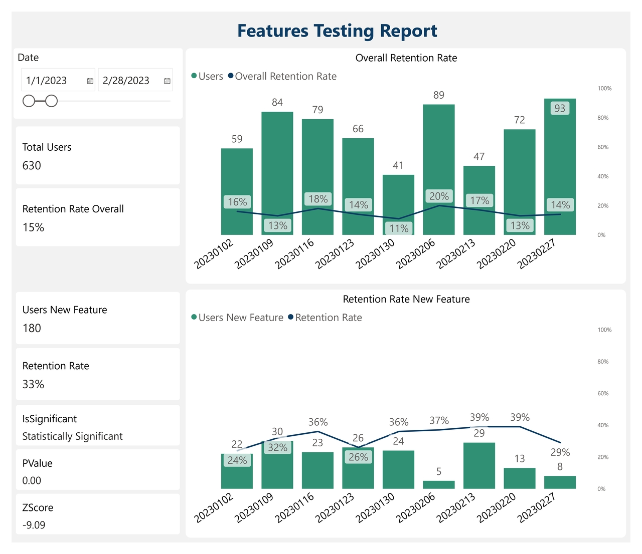
Features Testing Report
The report works in the following way:
Data collection: The report pulls each user’s login days, as well as the features they used in the app.
Data model: In the back-end, it calculates the retention rate of the users who have experienced the new feature you just built, and compares it with the overall retention rate. Next, it performs advanced calculations to check if the difference in retention rates is reliable, determining if your new feature has led to more users returning, or if the increase in retention occurred by chance. In other words, it assesses the statistical significance of the results.
Here is how you can use such a report:
Adoption Overview: The 2 cards next to the top chart show an overview of user’s adoption: 636 total users with an overall retention rate of 16%.
Features Validation: The first two cards next to the bottom chart show the adoption of one single feature: 107 users with a retention rate of 37%. These users experience a significantly higher retention (37% compared to the 16% overall). But does this difference occur by chance?
Statistical Significance: The last three cards indicate whether this difference in retention rate occurred by chance by checking its statistical significance. If the p-value is below the 5% threshold, then the new feature does indeed cause higher engagement.
Trend Analysis: The two charts show a trend of user’s retention week by week. The green bars indicate the number of users, and the line indicates the retention rate. You can observe that retention is higher in the first 4 weeks (15-18%).
This business intelligence solution, facilitated by Power BI and digital product analytics, allows you to validate in a data-driven way that the new feature does indeed increase engagement. This insight helps you prioritize more enhancements to this feature, knowing that it’s very likely to drive user growth.
Want faster, smarter insights from your data?
Book a quick 30-minute call to explore how I can support your organization’s goals.