Business Intelligence Solution to Personalize Offers Based on Purchase Patterns
Imagine being a vegetarian and receiving this message from a brand:
“Try our new range of gourmet steaks!”
It just seems out of touch and irrelevant, right?
Sending the same generic message to all customers makes them feel disconnected from your brand. It also causes missed revenue opportunities.
If you’re also trying to avoid sending messages that miss the mark, marketing analytics and tools like Power BI can provide invaluable support.
However, many struggle with deriving insights from data:
“Why are we double-counting values again?”
If you’re also interested in becoming data-driven, here’s an example of a business intelligence solution helping you increase revenue by segmenting customers based on purchase history.
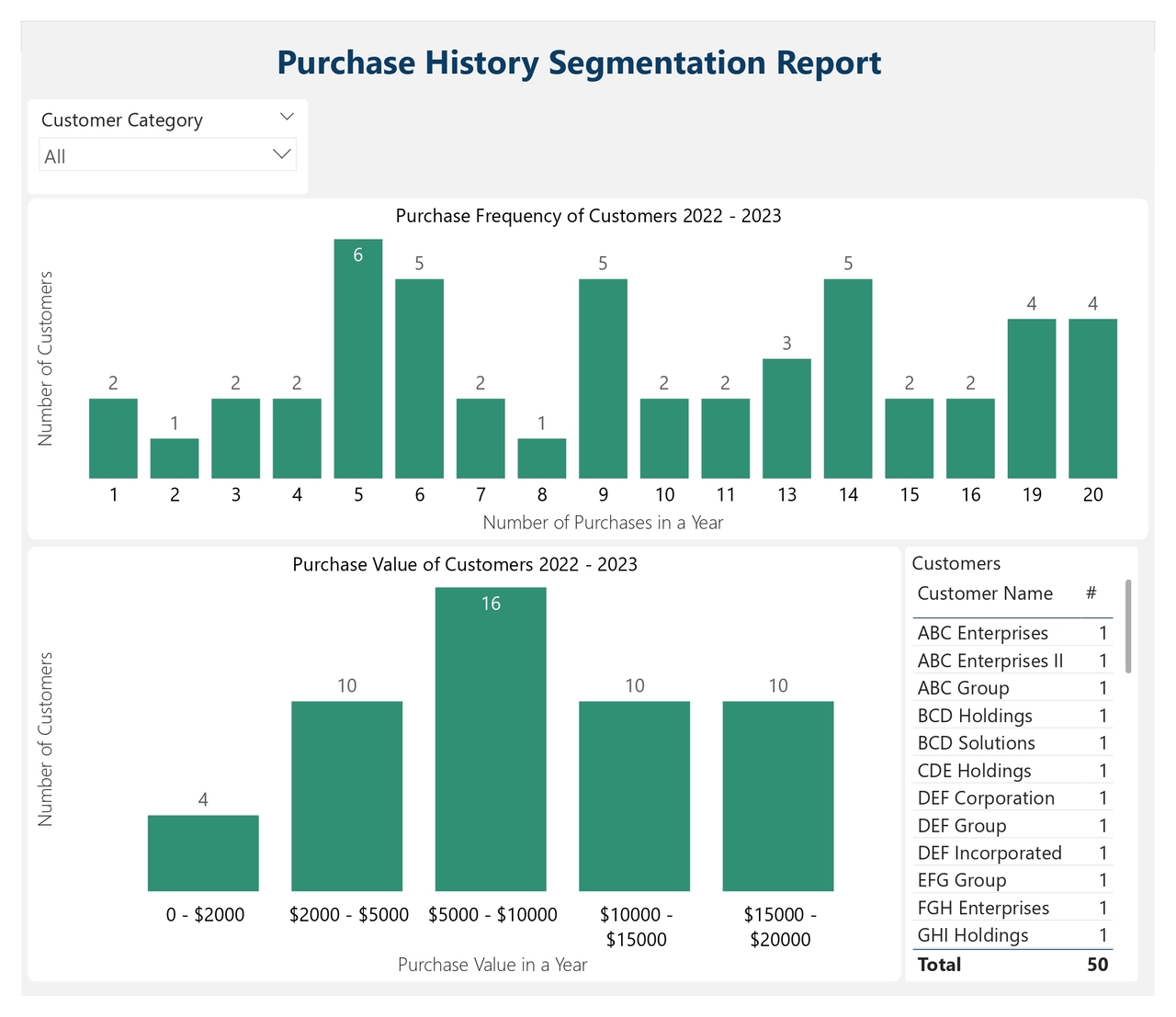
Purchase History Segmentation Report
The report works in the following way:
Data collection: It automatically pulls for each client every purchase date, value and product type they ordered.
Data model: It calculates for every client the number of purchases in a year and the total sales, and it groups every client into one of these four segments:
- High frequency, high value: Clients making purchases frequently with a high sales value.
- High frequency, low value: Clients making purchases frequently with a low sales value.
- Low frequency, high value: Clients purchasing infrequently with a high sales value.
- Low frequency, low value: Clients purchasing infrequently with a low sales value.
Here is how you can use such a report:
Segment Customers: Using the slicer at the top, choose one customer segment from the drop-down menu.
Customer Insights: The charts show the purchase frequency and the sales value for the respective customer segment. The green bars indicate the number of customers in the top chart, and sales value, in the bottom chart. For example, if you choose the “high frequency, high value” segment, you can visualize in the top chart the 22 customers placing orders more than 12 times in a year, and in the bottom chart, the total sales value of these orders: between $5000 and $10000.
Personalization: The table shows the customer names from the segment you selected. You can export these names to target them with personalized campaigns.
This analysis, facilitated by Power BI and marketing analytics, allows the marketing team to increase revenue by creating personalized campaigns tailored to each customer group:
For high-frequency, high-value clients, implement loyalty programs to maintain engagement.
To high-frequency, low-value purchasers, offer bundled discounts to encourage larger basket sizes.
For low-frequency, high-value purchasers, develop exclusive offerings to drive repeat purchases.
To low-frequency, low-value purchasers, send limited-time promotions to stimulate interest.
Want faster, smarter insights from your data?
Book a quick 30-minute call to explore how I can support your organization’s goals.